-
HTML/CSS
- 初心者
- 教材
- 無料
【無料】実務のスキルが身に付くコーディング教材(初心者編)
reset.cssについて
CSSを書いていく前に、まずはリセットCSSについて解説します。
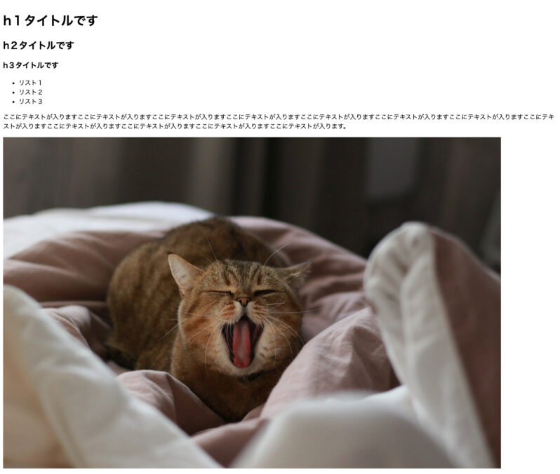
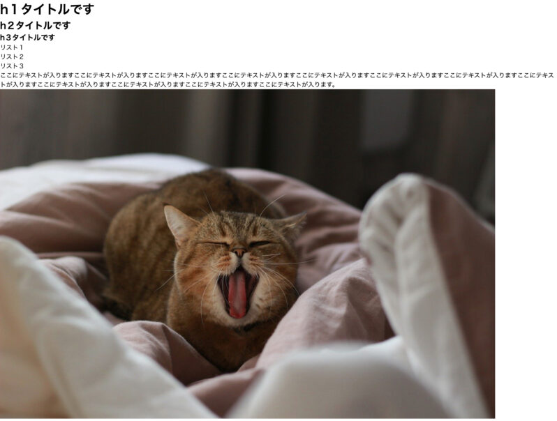
Webサイトを閲覧しているブラウザは、デフォルトでCSSが当たっています。何も指定しないままでコーディングをすると、H1やH2、画像の上下左右などデフォルトの余白が入ってしまいます。
意図した余白ではないため、デザインデータ通りにコーディングする際は邪魔になります。そのような理由から、デフォルトのCSSを打ち消すために「リセットCSS」を使用します。
下の参考画像は左がデフォルトのまま、右がreset.cssを導入しデフォルトのCSSを打ち消したものです。比較すると左側に比べて、右側は余白がなくなったのがわかると思います。
CSSファイルへのパスを指定する
headタグ内にCSSファイルのパスを追加します。
「reset.css」と「style.css」を読み込むために、下記のようにパスを指定してください。
※「reset.css」は必ず「style.css」の前に記述してください。
<head>
  <meta charset="UTF-8" />
  <meta http-equiv="X-UA-Compatible" content="IE=edge" />
  <meta name="viewport" content="width=device-width, initial-scale=1.0" />
  <link rel="stylesheet" href="./css/reset.css" />
  <link rel="stylesheet" href="./css/style.css" />
  <title>WP-LOAD LP</title>
</head>
headタグ全体は上記の記述になっていればOKです。
CSSを記述する
@charset “UTF-8”;
CSSを書き始めていきます。CSSは全て「style.css」に書いていきます。ファイルの1行目は下記の記述します。
@charset "UTF-8";CSSファイルの一番上に書くということだけ覚えれば問題はありません。
共通要素
まずは共通要素にスタイルを当てていきます。
一部ですが共通のデザインになっているものを表にまとめました。文字の大きさ・余白・配色は、一貫性があるので、CSSを少し記述するだけでデザインにぐっと近づいていきます。
| タグ | 配色 | 文字サイズ |
| h1 | color: #ffffff; | font-size: 40px; |
| h2 | color: #000000; | font-size: 32px; |
| h3 | color: #4aa7ff; | font-size: 24px; |
実際のCSSはこんな感じです。
@charset "UTF-8";

/* 共通 */
body {
  font-family: 'Helvetica Neue', Arial, 'Hiragino Kaku Gothic ProN',
    'Hiragino Sans', Meiryo, sans-serif;
}
h1 {
  font-size: 40px;
  font-weight: bold;
  margin-bottom: 10px;
  color: #ffffff;
}
h2 {
  color: #000000;
  text-align: center;
  margin-bottom: 80px;
  font-size: 32px;
  letter-spacing: 0.05em;
}
h3 {
  color: #4aa7ff;
  margin-bottom: 10px;
  font-size: 24px;
  letter-spacing: 0.05em;
}
p,
dl,
li {
  line-height: 1.8;
  color: #000000;
}
a {
  color: #074ab9;
}
section {
  max-width: 1080px;
  width: calc(100% - 40px);
  margin: 100px auto 0;
}
.content {
  margin-top: 60px;
}
body に font-family を書くことで、全ての要素に指定の文字が反映されます。
section は「max-width: 1080px;」で1080px以上はコンテンツが広がらないようにしています。
コメントアウトについて
コメントアウトは/* */の内側に書いているコードの処理は行いません。コードは消したくないけど、一時的にスタイルを当てたくない時に使用します。
/* コメントとして利用できます */

a {
  /* color: #074ab9; */
}

/* .content {
  margin-top: 60px;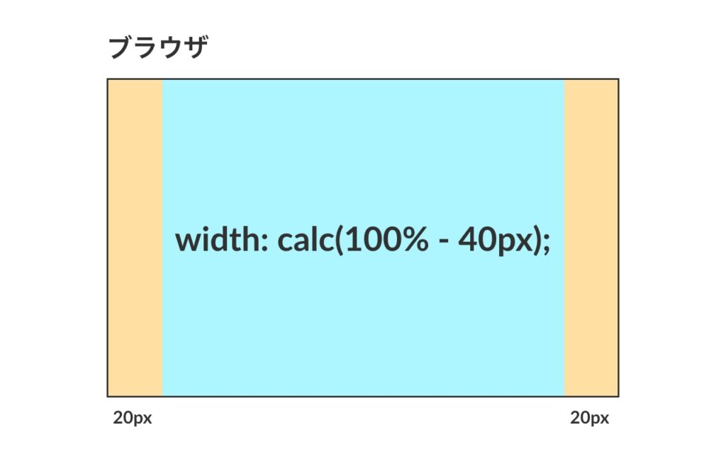
} */calcについて
sectionで記述している「width: calc(100% – 40px);」はレスポンシブの際に活躍する便利なコードです。calc を使うことで参考画像のように余白をレスポンシブができるようになります。
section {
  width: calc(100% - 40px);
}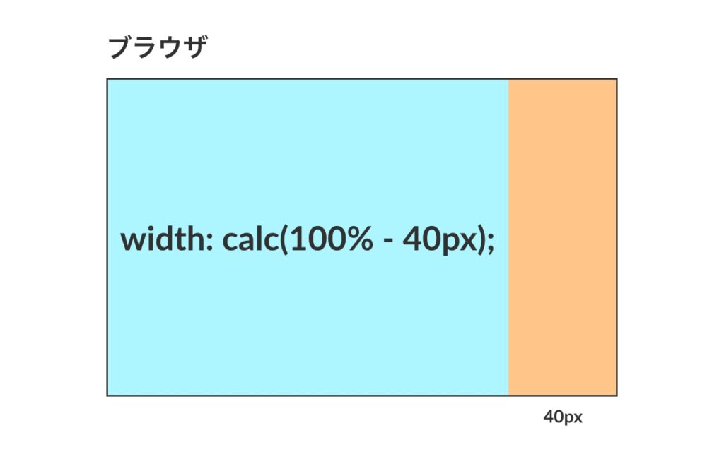
「section」の横幅は 100% – 40px が横幅になります。(画像の青い部分)
ブラウザの横幅が1080pxのとき、「1080px – 40px = 1040px」ブラウザが375pxのとき、「375px – 40px = 335px」と可変します。
section {
  width: calc(100% - 40px);
  margin: auto;
}
「width: calc( 100% – 40px );」と一緒に「margin: auto;」を書くことで、中央配置になります。「margin: auto;」はブロックを中央配置にしたい時によく使用するコードです。
マウスオーバー
マウスオーバーとはマウスのカーソルを要素に乗せたときに起こる動きのことです。
この教材では0.5秒かけて少し薄くするという動きにしています。
/* マウスオーバー */
a:hover {
  opacity: 0.7;
  transition: all 500ms;
}
aタグにスタイルを当てているため、aタグに囲われたテキスト・ボタン、全てに反映されます。
ボタン
塗りがあるボタン・塗りがないボタンの2パターンのボタンがあります。
/* ボタン */
.button a {
  display: flex;
  align-items: center;
  justify-content: center;
  max-width: 360px;
  width: 100%;
  height: 60px;
  box-sizing: border-box;
  margin-top: 40px;
  padding: 25px 35px;
  border-radius: 30px;
  color: #fff;
  font-size: 18px;
  font-weight: bold;
  text-decoration: none;
  letter-spacing: 0.1em;
  box-shadow: 0px 0px 20px 0px rgba(74, 167, 255, 0.15);
}
.button__main a {
  background: rgb(108, 99, 255);
  background: linear-gradient(
    90deg,
    rgba(55, 213, 214, 1) 0%,
    rgba(108, 99, 255, 1) 100%
  );
}
.button__border a {
  border: 2px solid #ffffff;
}
ボタンの大きさやボーダーの丸みなど、共通となるスタイルは .button a に書き、共通でない部分は「.button__main a」、「.button__border a」それぞれにスタイルを当てています。
横並びのflex
flex は横並びのセレクタです。親要素に「display: flex;」を書くと、子要素は全て横並びになります。
この記事では flex が多く出てくるので、flex について詳しく知りたい方は、下記の記事を参考にしてください。
ボタンで使用しているflex
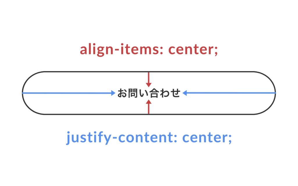
ボタンで flex を使用している理由は、中央配置が簡単にできるからです。flex は比較する要素がなくても中央配置にできるので便利です。
「align-items: center;」で縦幅の中央、「justify-content: center;」で横幅の中央となっています。
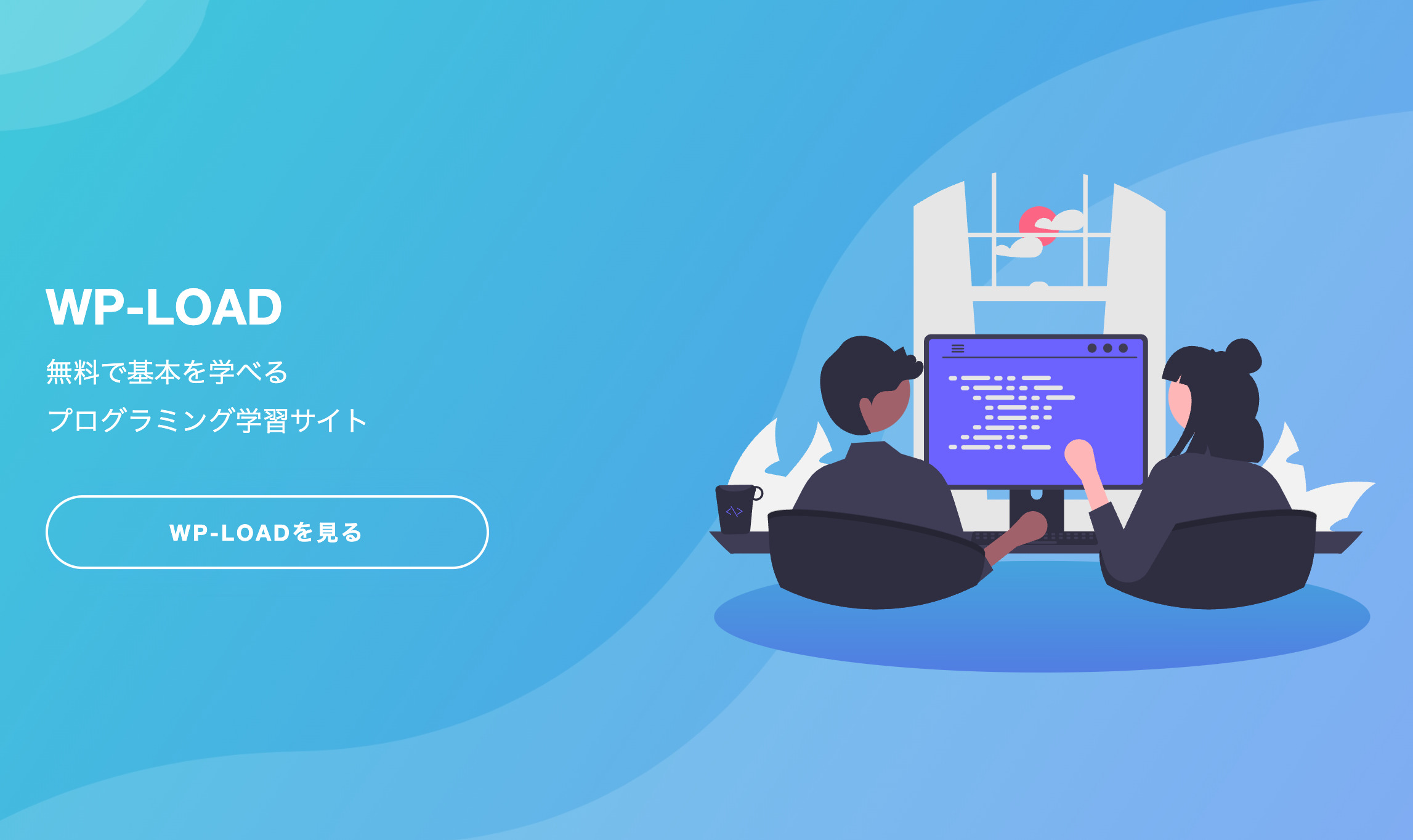
メインビジュアル
メインビジュアルではCSSで背景画像を読み込みます。読み込む時は階層が変わるため、HTMLの時のパスと書き方は変わります。
/* メインビジュアル */
.mainvisual {
  background-image: url(../images/mainvisual-bg_pc.jpg);
  background-size: cover;
  background-repeat: no-repeat;
  max-width: initial;
  width: 100%;
  height: 100vh;
  position: relative;
  margin: 0;
}
.mainvisual .wrapper {
  max-width: 1080px;
  width: calc(100% - 40px);
  display: flex;
  justify-content: space-between;
  align-items: center;
  position: absolute;
  top: 50%;
  left: 50%;
  transform: translate(-50%, -50%);
}
.mainvisual .catchcopy {
  width: 100%;
}
.mainvisual p {
  color: #ffffff;
  font-size: 22px;
}
max-width: initial;
「initial」は初期値に戻すプロパティです。共通要素のCSSで section に「max-width: 1080px;」を書きました。このままでは メインビジュアルもMAXの横幅が1080pxになってしまい、横幅を100%を使用して表示することができません。
そのため、「max-width: initial;」を書き、「max-width: 1080px; 」を打ち消しています。
height: 100vh;
「height: 100vh;」はブラウザの高さに沿って画像が可変して表示されるCSSです。
ビューポート(vh)という単位を呼ばれる単位で、100vh = ブラウザの高さになります。
position
.mainvisual の中にあるコンテンツがどのようにして配置されているかざっくり解説します。まず、position の基本について説明します。(今回は absolute の使い方のみ)

position は「親要素」に「position: relative;」を書き、「子要素」に「position: absolute;」を書くことで、「子要素」は「親要素」の範囲内で好きな位置へ配置できるようになります。
例えば、上の画像で「left: 0;」「top: 0;」を書くと、親要素の左上にぴったり配置されます。
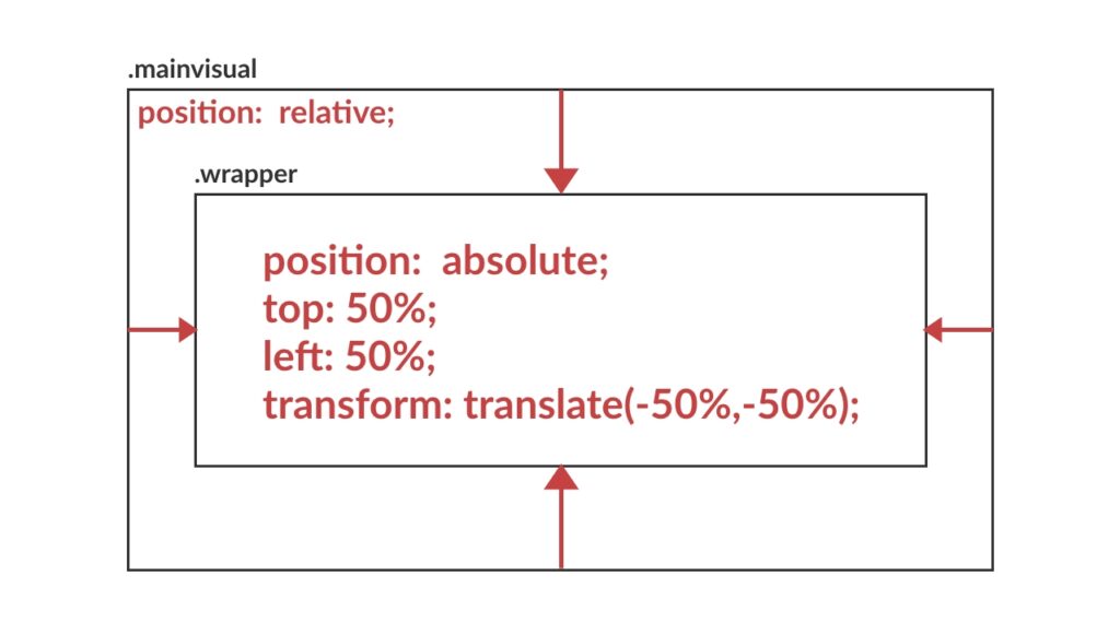
今回のLPのメインビジュアルに戻ります。.mainvisual(親要素)に「position: relative;」を書き、.wrapper(子要素)に「position: absolute;」を書くことで .wrapper は .mainvisual 内の好きな位置に配置することができるようになります。
.wrapper が中央配置になるように50%と値を指定して完了です。この記述は position で要素を中央配置に指定したいときによく使います。
メイン(main)
WP-LOADについて
/* WP-LOADについて */
.about .content {
  display: flex;
  align-items: center;
}
.about img {
  margin-right: 60px;
}
このLPについて
/* このLPについて */
.attention {
  padding: 80px;
  box-shadow: 0px 0px 20px 0px rgba(74, 167, 255, 0.15);
}
.attention h2 {
  margin-bottom: 40px;
}
.attention h3 {
  margin-top: 40px;
}
ライターさん募集中!
/* ライターさん募集中 */
.writer .wrapper {
  display: flex;
  align-items: center;
}
.writer img {
  margin-right: 60px;
}
.writer p,
.writer dl {
  margin-bottom: 1em;
}
.writer dl {
  font-weight: bold;
}
Webサイト制作依頼について
/* WEBサイト作成依頼について */
.contact .wrapper {
  display: flex;
  align-items: center;
}
.contact img {
  margin-left: 60px;
}
フッター(footer)
/* フッター */
.footer {
  position: relative;
  background: transparent linear-gradient(90deg, #5d55e8 0%, #37d5d6 100%) 0% 0%;
}
.footer .wrapper {
  padding: 80px 0;
}
.footer h2 {
  color: #ffffff;
  text-align: left;
  font-size: 28px;
  font-weight: bold;
  margin-bottom: 20px;
}
.footer p {
  color: #ffffff;
}
.footer__link {
  margin-bottom: 0;
  border-top: 1px solid #ffffff;
}
.footer__link a {
  display: block;
  width: 100%;
  padding: 20px 0;
  color: #ffffff;
  text-decoration: none;
  text-align: center;
  font-size: 18px;
}
/* トップへ戻るボタン */
.button__to-top {
position: absolute;
right: 20px;
bottom: 30px;
text-align: center;
}
.button__to-top a {
display: inline-block;
padding: 20px;
border-radius: 50% 50%;
text-decoration: none;
background: transparent linear-gradient(230deg, #37d5d6 0%, #5d55e8 100%) 0%
0%;
box-shadow: 0px 0px 30px #4aa7ff80;
}
.button__to-top span {
color: #ffffff;
display: block;
font-size: 12px;
font-weight: bold;
letter-spacing: 0.1em;
}レスポンシブ対応
ここまではPCで綺麗に見せるための記述をしてきました。次からは携帯でもレイアウトが綺麗に見えるようレスポンシブの対応を行なっていきます。
メディアクエリを使用してブレイクポイントを設定していきます。レスポンシブってそもそも何?という方は、下記の記事にざっと目を通してみてください。
今回ブレイクポイントは、「768pxまでの幅の時」と「それ以上(769px~)の幅の時」で切り替えています。
レスポンシブのレイアウトで注意したいのが、PCでは横並びだったのがスマホサイズでは縦並びになります。この時縦並びにする方法は2パターンあります。
- 「display: flex;」を打ち消して縦並びにする(display: block;で flex 打ち消す)
- 「flex-direction: column-reverse;」で縦並びにする
この教材では上記の2つの方法をどちらも利用して縦並びにしています。
/* レスポンシブ(スマホサイズ) */
@media screen and (max-width: 768px) {
/* 共通 */
section {
margin: 80px auto 0;
}
h1 {
font-size: 32px;
}
h2 {
margin-bottom: 40px;
font-size: 22px;
}
h3 {
font-size: 16px;
}
p,
li,
dt,
dd {
font-size: 14px;
}
p {
margin-bottom: 1em;
}
img {
width: 100%;
}
/* フッター */
.footer__link a {
font-size: 16px;
}
.button__to-top a {
padding: 12px;
}
.button__to-top img {
width: 20px;
}
/* ボタン */
.button {
max-width: 360px;
margin: auto;
}
.button a {
font-size: 15px;
}
/* メインビジュアル */
.mainvisual {
background-image: url(../images/mainvisual-bg_sp.jpg);
}
.mainvisual .wrapper {
flex-direction: column-reverse;
text-align: center;
}
.mainvisual img {
margin-bottom: 40px;
}
.mainvisual p {
font-size: 18px;
}
/* WP-LOADについて */
.about .content {
display: block;
}
.about img {
display: block;
max-width: 234px;
margin: 0 auto 20px;
}
/* このLPについて */
.attention {
padding: 60px 20px;
}
.attention h3 {
margin-top: 40px;
}
/* ライターさん募集中 */
.writer .wrapper {
display: block;
}
.writer img {
display: block;
max-width: 234px;
margin: 0 auto 30px;
}
/* WEBサイト作成依頼について */
.contact {
margin-top: 80px;
}
.contact .wrapper {
padding: 60px 0;
flex-direction: column-reverse;
}
.contact img {
max-width: 234px;
margin: 0 0 30px 0;
}
.contact h2 {
margin-bottom: 10px;
font-size: 22px;
}
}CSS完成形
最終的にCSSはこのようになっていればOKです。
@charset "UTF-8";
/* 共通 */
body {
font-family: 'Helvetica Neue', Arial, 'Hiragino Kaku Gothic ProN',
'Hiragino Sans', Meiryo, sans-serif;
}
h1 {
font-size: 40px;
font-weight: bold;
margin-bottom: 10px;
color: #ffffff;
}
h2 {
color: #000000;
text-align: center;
margin-bottom: 80px;
font-size: 32px;
letter-spacing: 0.05em;
}
h3 {
color: #4aa7ff;
margin-bottom: 10px;
font-size: 24px;
letter-spacing: 0.05em;
}
p,
dl,
li {
line-height: 1.8;
color: #000000;
}
a {
color: #074ab9;
}
section {
max-width: 1080px;
width: calc(100% - 40px);
margin: 100px auto 0;
}
.content {
margin-top: 60px;
}
/* マウスオーバー */
a:hover {
opacity: 0.7;
transition: all 500ms;
}
/* ボタン */
.button a {
display: flex;
align-items: center;
justify-content: center;
max-width: 360px;
width: 100%;
height: 60px;
box-sizing: border-box;
margin-top: 40px;
padding: 25px 35px;
border-radius: 30px;
color: #fff;
font-size: 18px;
font-weight: bold;
text-decoration: none;
letter-spacing: 0.1em;
box-shadow: 0px 0px 20px 0px rgba(74, 167, 255, 0.15);
}
.button__main a {
background: rgb(108, 99, 255);
background: linear-gradient(
90deg,
rgba(55, 213, 214, 1) 0%,
rgba(108, 99, 255, 1) 100%
);
}
.button__border a {
border: 2px solid #ffffff;
}
/* メインビジュアル */
.mainvisual {
background-image: url(../images/mainvisual-bg_pc.jpg);
background-size: cover;
background-repeat: no-repeat;
max-width: initial;
width: 100%;
height: 100vh;
position: relative;
margin: 0;
}
.mainvisual .wrapper {
max-width: 1080px;
width: calc(100% - 40px);
display: flex;
justify-content: space-between;
align-items: center;
position: absolute;
top: 50%;
left: 50%;
transform: translate(-50%, -50%);
}
.mainvisual .catchcopy {
width: 100%;
}
.mainvisual p {
color: #ffffff;
font-size: 22px;
}
/* フッター */
.footer {
position: relative;
background: transparent linear-gradient(90deg, #5d55e8 0%, #37d5d6 100%) 0% 0%;
}
.footer .wrapper {
padding: 80px 0;
}
.footer h2 {
color: #ffffff;
text-align: left;
font-size: 28px;
font-weight: bold;
margin-bottom: 20px;
}
.footer p {
color: #ffffff;
}
.footer__link {
margin-bottom: 0;
border-top: 1px solid #ffffff;
}
.footer__link a {
display: block;
width: 100%;
padding: 20px 0;
color: #ffffff;
text-decoration: none;
text-align: center;
font-size: 18px;
}
/* トップへ戻るボタン */
.button__to-top {
  position: absolute;
  right: 20px;
  bottom: 30px;
  text-align: center;
}
.button__to-top a {
  display: inline-block;
  padding: 20px;
  border-radius: 50% 50%;
  text-decoration: none;
  background: transparent linear-gradient(230deg, #37d5d6 0%, #5d55e8 100%) 0%
    0%;
  box-shadow: 0px 0px 30px #4aa7ff80;
}
.button__to-top span {
  color: #ffffff;
  display: block;
  font-size: 12px;
  font-weight: bold;
  letter-spacing: 0.1em;
}
/* WP-LOADについて */
.about .content {
display: flex;
align-items: center;
}
.about img {
margin-right: 60px;
}
/* このLPについて */
.attention {
padding: 80px;
box-shadow: 0px 0px 20px 0px rgba(74, 167, 255, 0.15);
}
.attention h2 {
margin-bottom: 40px;
}
.attention h3 {
margin-top: 40px;
}
/* ライターさん募集中 */
.writer .wrapper {
display: flex;
align-items: center;
}
.writer img {
margin-right: 60px;
}
.writer p,
.writer dl {
margin-bottom: 1em;
}
.writer dl {
font-weight: bold;
}
/* WEBサイト作成依頼について */
.contact .wrapper {
display: flex;
align-items: center;
}
.contact img {
margin-left: 60px;
}
/* レスポンシブ(スマホサイズ) */
@media screen and (max-width: 768px) {
/* 共通 */
section {
margin: 80px auto 0;
}
h1 {
font-size: 32px;
}
h2 {
margin-bottom: 40px;
font-size: 22px;
}
h3 {
font-size: 16px;
}
p,
li,
dt,
dd {
font-size: 14px;
}
p {
margin-bottom: 1em;
}
img {
width: 100%;
}
/* フッター */
.footer__link a {
font-size: 16px;
}
.button__to-top a {
padding: 12px;
}
.button__to-top img {
width: 20px;
}
/* ボタン */
.button a {
font-size: 15px;
}
/* メインビジュアル */
.mainvisual {
background-image: url(../images/mainvisual-bg_sp.jpg);
}
.mainvisual .wrapper {
flex-direction: column-reverse;
text-align: center;
}
.mainvisual img {
margin-bottom: 40px;
}
.mainvisual p {
font-size: 18px;
}
/* WP-LOADについて */
.about .content {
display: block;
}
.about img {
display: block;
max-width: 234px;
margin: 0 auto 20px;
}
/* このLPについて */
.attention {
padding: 60px 20px;
}
.attention h3 {
margin-top: 40px;
}
/* ライターさん募集中 */
.writer .wrapper {
display: block;
}
.writer img {
display: block;
max-width: 234px;
margin: 0 auto 30px;
}
/* WEBサイト作成依頼について */
.contact {
margin-top: 80px;
}
.contact .wrapper {
padding: 60px 0;
flex-direction: column-reverse;
}
.contact img {
max-width: 234px;
margin: 0 0 30px 0;
}
.contact h2 {
margin-bottom: 10px;
font-size: 22px;
}
}
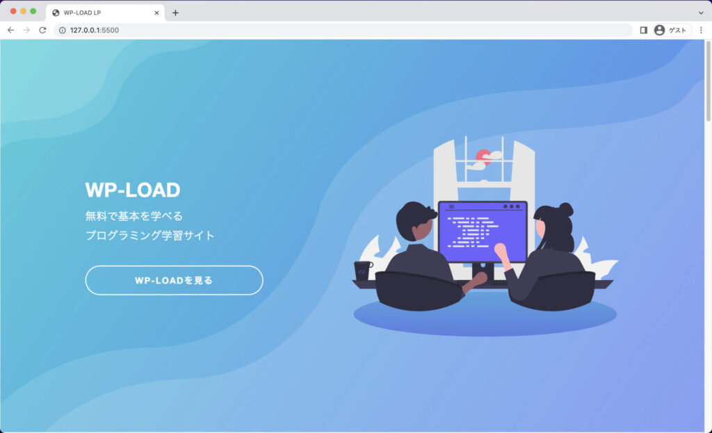
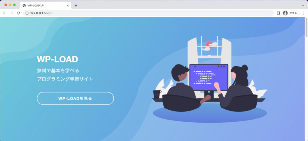
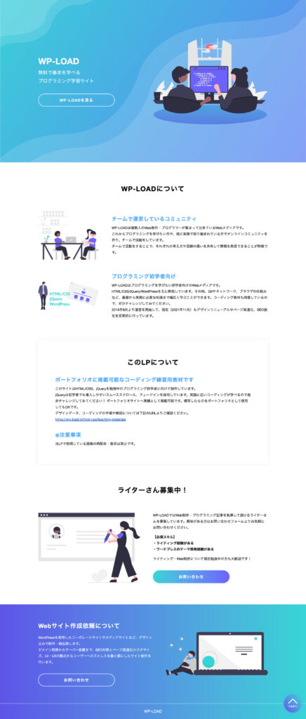
ブラウザで画像のように表示されていたら、HTML/CSS はこれで完成です。
お疲れ様です。次は jQuery でサイトに動きをつけていきます。